Minimalism began as an artistic movement in the US in the 1960s. In visual arts it meant moving from abstract expressionist painting to more simplified, geometric shapes. Minimalists claimed their art was not so much about self expression, but rather a more objective method of creating. Minimalism includes balanced forms, neutral surfaces, repetition, geometry, color, etc.
In photography, minimalism is still very much present, although it received critiques on lacking subject matter and a point of view. But there is a certain kind of openness in minimalism that actually gives an artist freedom to not be weighted by preconceived concepts and ideas. It welcomes all interpretation, without giving any clear cut answers.
Simplicity
Minimalism in photography is all about simplicity. Clear your shot of any unnecessary information or action. Minimalistic images are static in the sense that there is not a lot going on. So it is up to you to find a charm in the simplicity that will make the image visually interesting. Use strong colors and shapes to make a statement. A photograph does not have to be cluttered with details to be effective.
Get closer
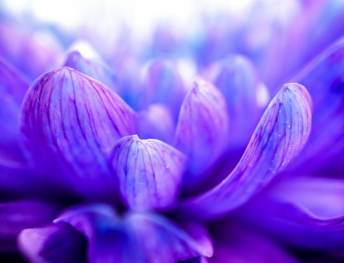
While you are training your eye to recognize more simplistic shapes, one thing you can do is to get closer to whatever you are photographing. Frame your image in such a way that only a part of an object is included. That way the shape of said object will become more important than the object itself. You can also do this in post-processing. Sometimes cropping a photograph in a specific way will make a great difference.
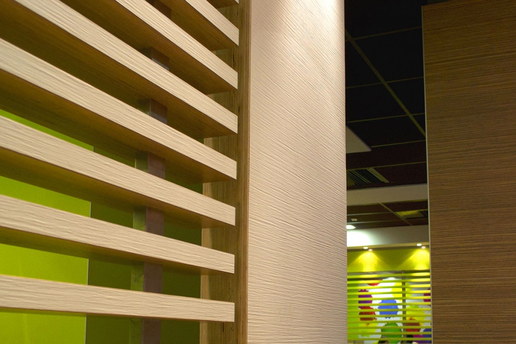
Think about how the placement of lines and textures affects your composition
Composition
Because there is not a bunch of elements in a photograph, you have to pay more attention to the composition. How you arrange objects and shapes in an image is crucial. In the previous article we talked about positive and negative space in photography. That is a tool you can easily use to help you create compelling minimalist photographs.
Color
Color plays an important role in minimalist photography, because the form is so simple. Understanding and using color is a subject we largely covered in our series of articles on Color theory. Check them out to learn more about which combinations of colors should be used for a more effective image.
Lines and textures
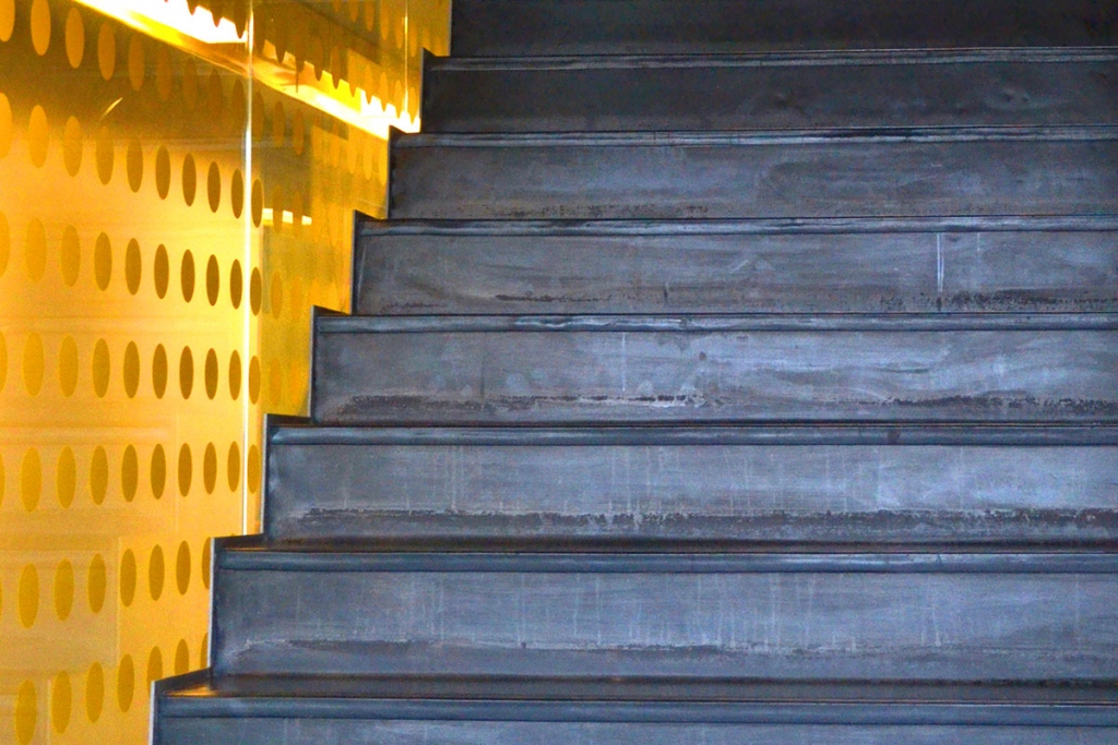
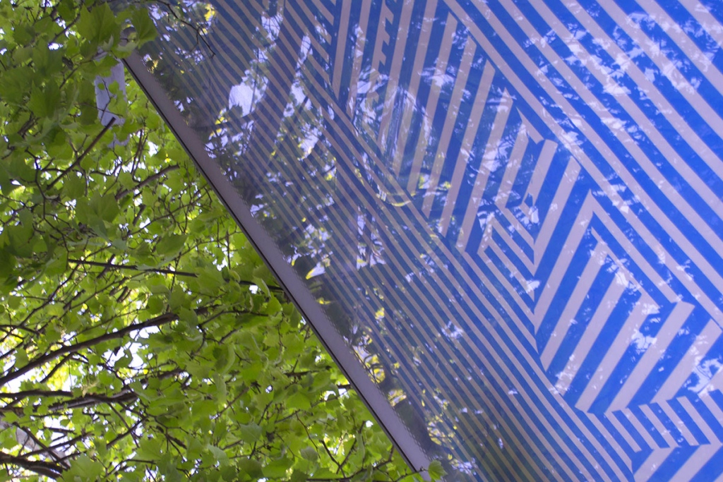
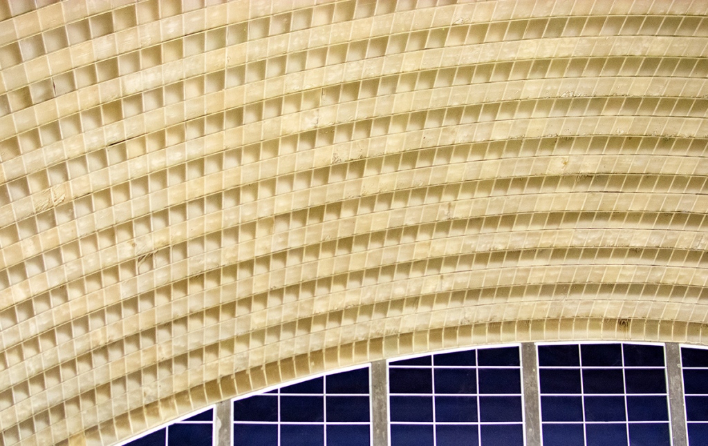
Lines and textures can be used to grab attention even without a clear subject matter. Think about how the placement of lines affects the general composition. Combine horizontal, vertical and diagonal lines in one shot by zooming in on the boundaries of versatile textures. This play within the shot will be the point of attraction for the viewer.
Keep noticing the world around you and you will see that any scene can be translated into a minimalistic photograph just by making a few tweaks in your perception and camera placement. Look for brightly colored surfaces and textures, individual objects with clean lines and geometric shapes. They can be found in nature, but they will probably be more common in urban architecture, so that is a good place to start!
