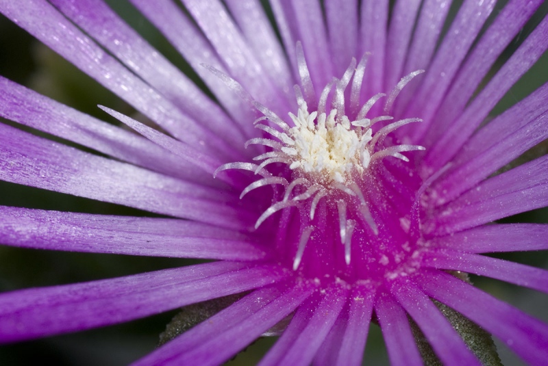
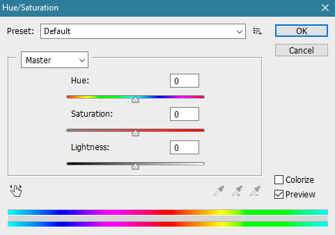
There are a number of different ways of representing the same color, as every color contains dimensions. On the computer screen, the primary colors of light are mixed additively, so they produce white light. These colors are known to us as the RGB color system, which is commonly used in digital cameras and monitors. Graphic designers on the other hand, use CMYK color system, which is commonly used in printing.
Dimensions of colors
In the history of color theory many researchers have made efforts to sort colors in such a way that would enable their notation and defining characteristics. Every color has three dimensions: hue, lightness and saturation. This is called the HSL method which is used in Photoshop and it is supposed to be the closest to what the human eye can see.
Hue
Clean colors in their full strength are indicated by their hue, which changes as we move around the color circle. Hue is the characteristic by which colors differ from each other: yellow from orange, green from yellow, blue from green etc. Colors that are opposite in the color wheel are complementary colors.
Lightness
Color lightness or brightness is the second dimension of color. Two colors can be of the same shade but different color lightness. According to their lightness, we are able to recognize dark blue from light blue, dark red from light red etc. Colors from the color spectrum have their natural grade of lightness when they are the most saturated. Intensive yellow for example is the brightest, while purple is the darkest color in the color circle.
The grade of brightness in a color can be changed by adding a lighter or darker color to it. Theoretically, when adding white to a bright saturated yellow, the only thing that changes is the brightness. But practically, brightness cannot be isolated; yellow mixed with white will become brighter but also less saturated. By adding white or black to a color, it can also change its shade. Adding black to red will make it seem cooler, adding black to yellow will make it greenish.
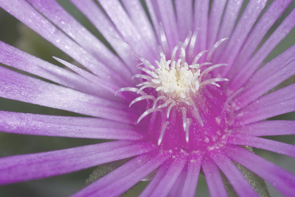
By increasing the brightness in a photo, the main color becomes less saturated.
The effect of color brightness also depends on the lightness of the surface, i.e. on the background on which the surface is located. Every color can seem lighter next to a darker color or darker next to a lighter color.
Saturation
The third dimension of color is saturation. Two colors can be the same brightness and shade but different in the grade of saturation. We can reduce the saturation of a color by adding white, black, gray or a complementary color. The same as with brightness, a color can look more or less saturated depending on which color surrounds it.
Red and green are complementary colors. By increasing green tones in the background, the reds in the ladybug seem more saturated, although we did not change them.
Understanding the photography color wheel and how dimensions of colors communicate with each other will increase your abilities to describe and justify your decisions in the picture making process. Having knowledge about why adding yellow reduces blue and vice versa may seem redundant, but in time by training your eye it becomes second nature.
