The Rule of Thirds is one of the most used composition techniques. The idea is that you can break an image down into thirds both vertically and horizontally so that you have 9 sections. The subject should be aligned with the guidelines and the intersection points, with the horizon on the top or bottom line; or to have the linear features in the photo flow between sections.
Though this concept makes for a great starting point, there are a number of techniques beyond the Rule of Thirds to create a more interesting photo that is just as compositionally balanced.
Symmetry and Centered Composition
Going against the Rule of Thirds is the idea to maintain perfect symmetry with your main subject in the center of your photo. This makes for great road and architectural shots. Reflections are also great for producing symmetry.
Leading Lines
Lead the viewer through your photo with leading lines. This will bring emphasis on important elements in your image as well. You can use anything from walls, paths or patterns to create this effect.
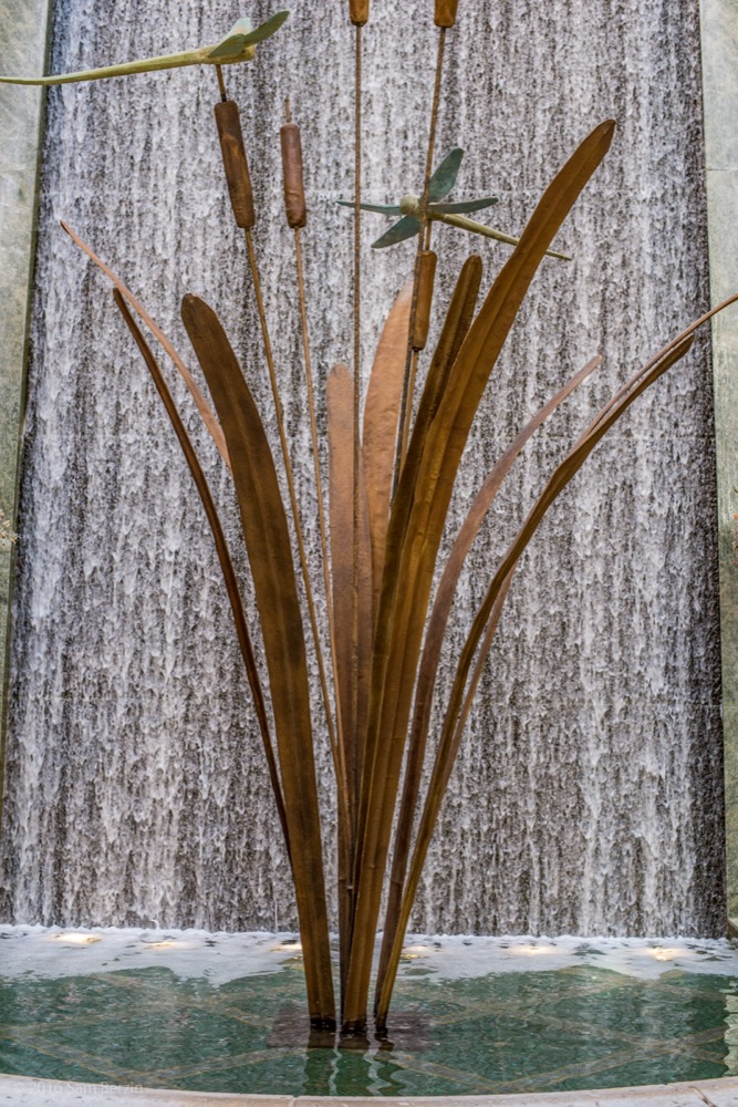
Depth and Foreground Interest
Photography is 2D by nature. To produce an image that doesn’t have the sense of being flat, include some foreground interest. This will add depth to your photo and give it more of a 3D feel.
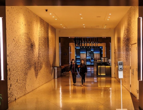
Frame Within the Frame
You can also add depth with double framing. Overhanging branches, arches and windows are great to frame your scene. And remember it doesn’t need to surround the entire composition for it to be effective.

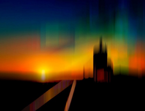
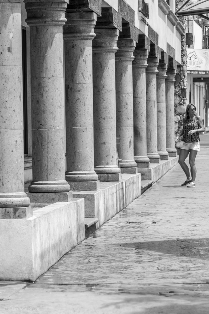
Diagonals and Triangles
This technique is used to add “dynamic tension” to an image. We are used to a sense of stability, provided by horizontal and vertical lines. When you place a subject on a sloping surface, it will seem less stable, with an element of visual tension. As we’re not used to diagonals in our day-to-day, they suggest a subconscious instability. You can use actual triangle-shaped objects you see architecturally or implied with the way you angle a path or wall.

Rule of Space
This applies to the direction your subject is facing or moving towards. There should always be more space in front of your subject than behind it to imply that there is further space in the frame for it to move into. This allows for movement in your image.