Color in food photography is definitely essential! It’s almost impossible to list the infinite possibilities and feelings that it brings into our eyes. Food photography hasn’t smell, it hasn’t taste, but it definitely has emotion and action! So the first thing to take into account when composing a photo is actually your main subject: The Food! All color combinations and choices will derive from this established element. It’s important to keep the viewer’s attention on it! A beautiful background, atmosphere and story will help build the frame and the final message of the shoot. However, the protagonist should be showcased and speak more loud than the supporting roles.
A bit about the color wheel and the color theory
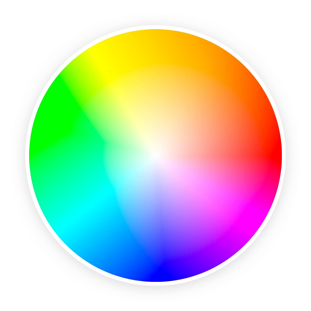
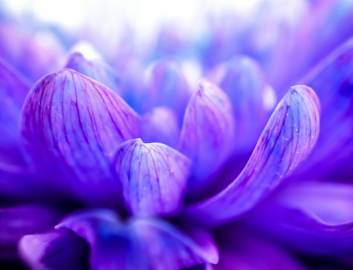
Color in food photography is also about art, and then it should borrow some definitions, rules and knowledge from other creative areas. To explain the combination guidelines, let’s imagine a Color wheel that brings the complementary and analogous colors. The complementary are opposite in the Color wheel and cause contrast when combined. By the other side, analogous colors are next to each other on the wheel and there’s a dominant element from where the others derive.
When the Dishware breaks the ice
That said, it’s essential to use these relations to showcase the food and bring it into the spotlight. In most cases when using contrast with Color in food photography, white plates and bowls help separate the structure and carry the sight to the food. Generally, patterns on plates (even they are mostly white) cause distraction and reduce the focus on the subject. So be careful when selecting the dishware and fabrics to your collection, prefer the basic and plain, this way, you will be able to play around more times.
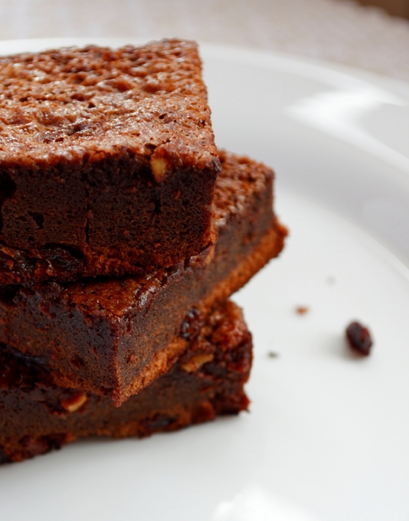
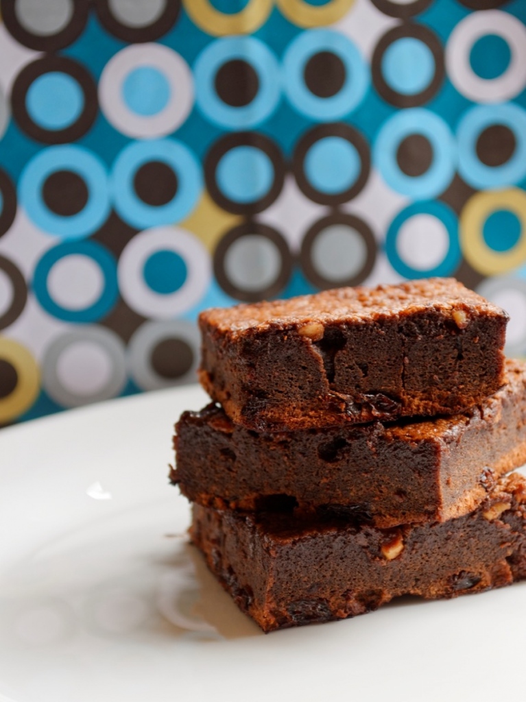
Brownies are great subjects for food photography tips! See in this picture how the white plate creates a nice highlight for the frame, even with neutral colors on the back. You can clearly see the variation inside the pieces and the brightness on the top. Observe this second image, now with another texture as background. In the second picture, the combination of colors creates a nice contrast and the plate sets a limit. White surfaces also help by reflecting and lighting up the food.
Composing with Yellow
Seasoned pasta, fruits, bell peppers, purees, baked potatoes… Yellow stays between greens and oranges to red. Feel free to use these analogous colors and experiment with the props. In order to introduce contrast, apply the complementary colors, like blue tones. Fabrics and painted wood work great!
Composing with Green
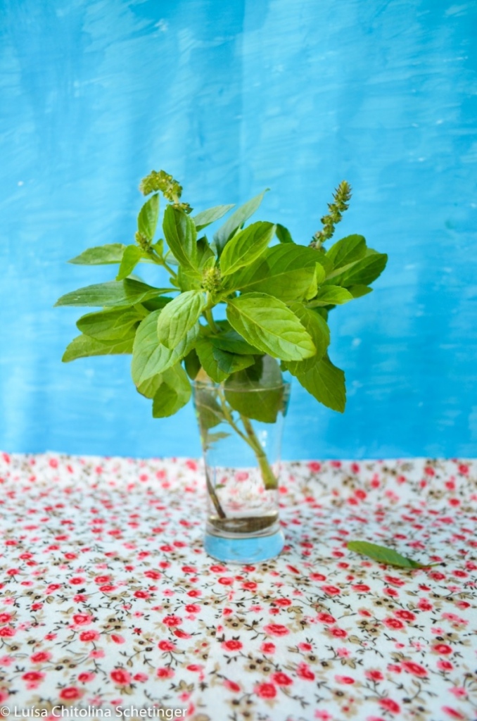
Green subjects, like avocado, salads, herbs and spices allow many compositions. You can use both the analogous and complementary colors. Remember to focus on the main pigment of the food; In other words, the main color of a tomato soup with basil leaves would be red and not green. However, all the interactions and experiments will direct you to the right choice.
Composing with Red tones
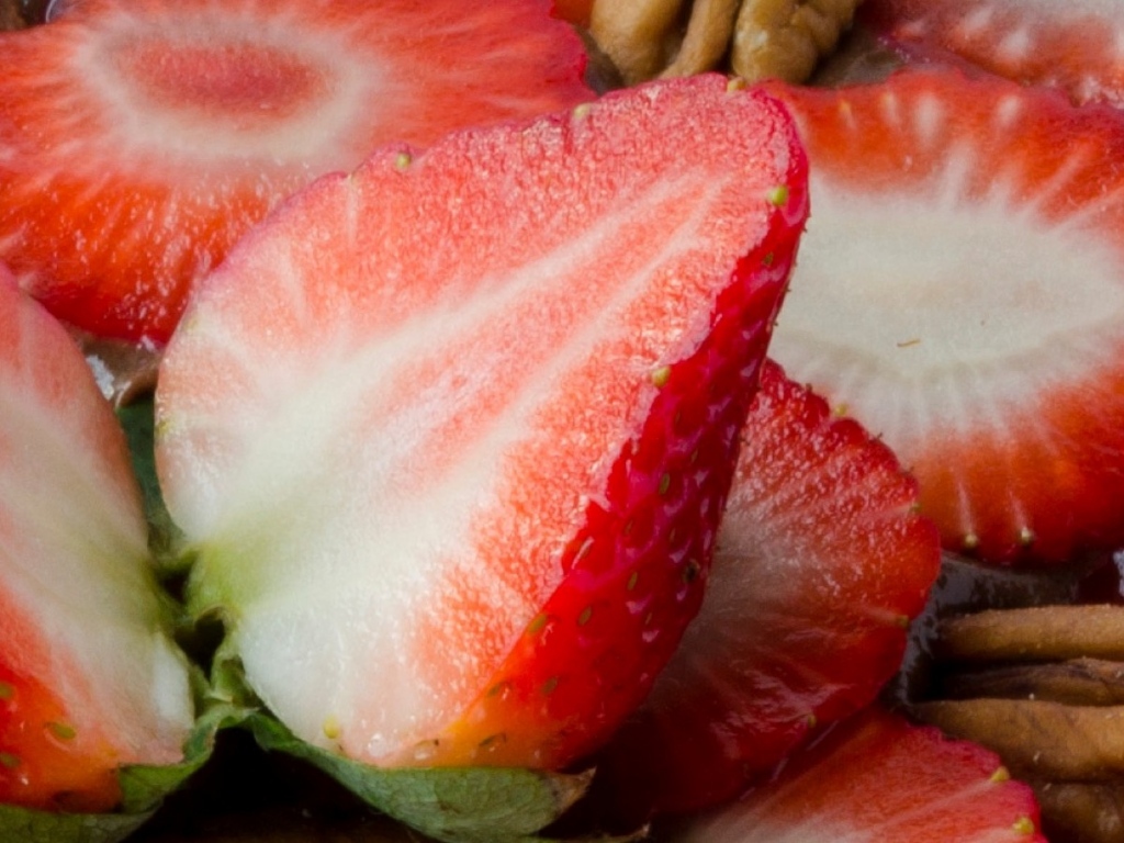
Red and orange soups, papayas, salmon, strawberries and desserts… Foods like these will naturally call attention inside the scene. When you have this Color in food photography, one of the best things to do is to create a neutral environment and allow it to naturally shine.
This way, there is just a rough guideline to help when setting color in food photography. You can use the wheel borrowed from the art classes and start making different combinations. Something might work great or not, depending on the kind of subject. Start with an empty plate and end up with a masterpiece!

